Composer
Throughout my career, I’ve straddled product design and (mostly UI) engineering. I particularly enjoy working on complex workflows, data visualization, and other complex UI problems. As a result, I’ve often found myself working with or building design systems and custom component libraries.
In 2021, I helped a startup design and build the first version of their product. I spent most of my time creating designs in Figma and writing code to build out the necessary features. Most features were a combination of forms, tables, and multi-step workflows.
My approach to the UI code was straightforward and productive: take material-ui, theme it, constrain the flexibility of the foundational components, and then build some custom components on top of it.However, in Figma, I found myself wishing I could just design with the design system components I had in the UI code. Instead, I had to manually create the design system components in Figma after already having done the work in the UI code.
I decided to take a few months to prototype a solution. It turns out that this is a really complex problem!
I went through a few iterations, the furthest along of which is a prototype called Composer.
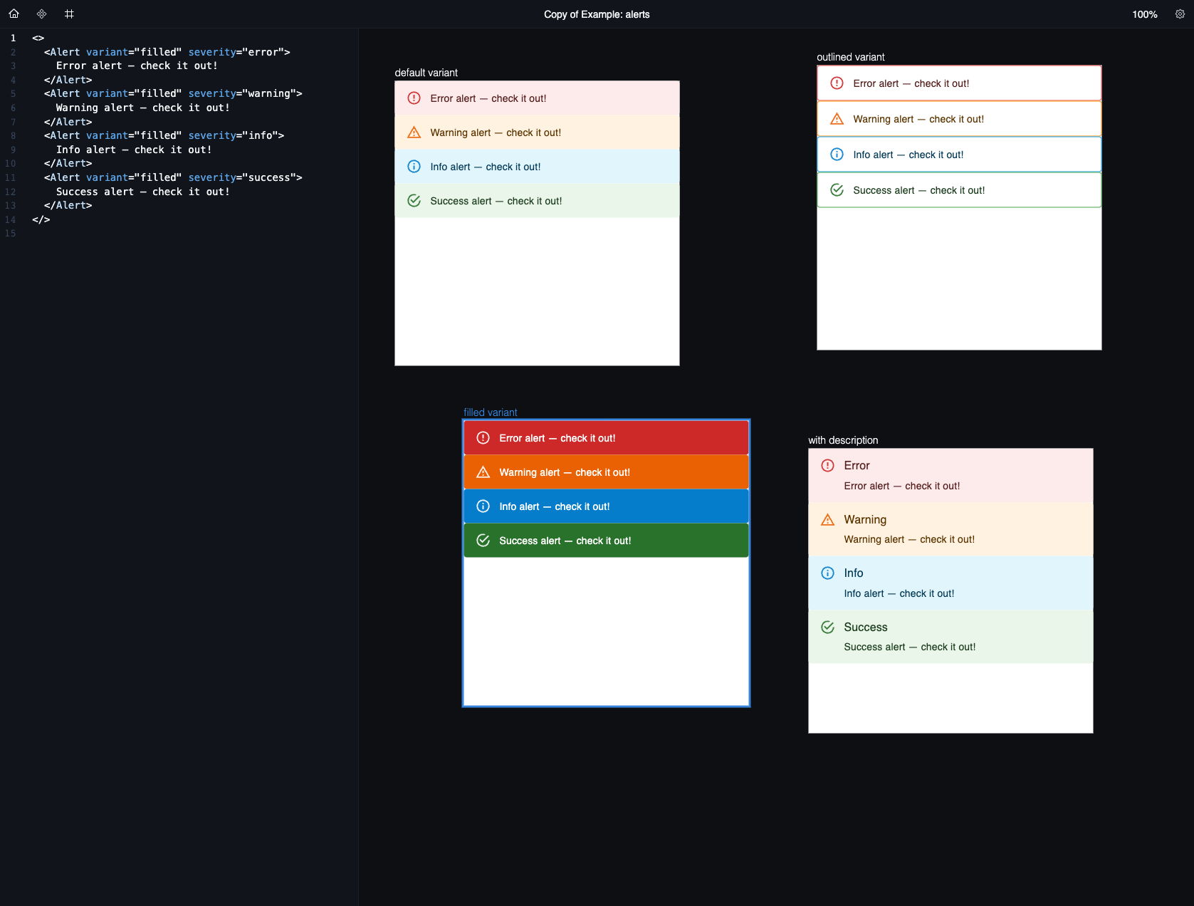
Composer is more of a tool for design and product-minded frontend engineers than it is a replacement for Figma. It’s kind of a mash-up of Figma and VSCode. The idea is that you can quickly put together code snippets (which I’ll refer to as “Snippets” for the rest of this post) from your UI library of choice to put together UI designs. Like Figma, you can put these different designs in frames and move those frames around. A frame’s contents are defined by JSX code blocks. You can write these code blocks manually, or you can pull in Snippets from the Snippet library.
Composer’s current functionality is limited. It only supports material-ui components as the source design system, and I wrote a few manual code Snippets for material-ui’s snippet library, but most material-ui components do not have Snippets defined yet.
Snippets
Working on Composer, I became most excited by the idea of Snippets. It got me thinking that the ideal workflow for a frontend engineer who is becoming familiar with a new design system is to:
- Browse the documentation for that design system to become familiar with all the different types of components.
- Look more closely at the components - and the variants of those components - that the engineer needs for what they are working on.
- In their code editor, the engineer should be able to quickly find and use Snippets for those component variants.
Similarly, the ideal workflow for a product designer would be to quickly find and use the same component variants in their designs.
Next steps
I think that the current functionality of Composer is really better suited to be a component playground, i.e. a feature of a design system’s documentation, instead of a standalone design tool. I guess this isn’t too surprising, since Playroom was one of the sources of inspiration. Snippets seem like a really powerful concept to me, since they could enable better and faster documentation creation, a faster coding experience via editor integrations, and other tools to be built on top of them.
Putting all of this together, Composer should grow into a design system ops tool. It could automatically generate Snippets based on a component’s types, while providing a way to customize the Snippet generation (excludable props, manually defined Snippets for more complex components). Integrations could be built for VSCode and other editors so that engineers can use Snippets in day-to-day programming. Many of the startups I spoke to use multiple component libraries (e.g. material-ui, radix, a charting library, and their own component library), and being able to quickly pull functioning code Snippets from each would be really powerful. Exporting these Snippets to Figma (e.g. what Anima is doing with Storybook) would also allow designers to pull in the latest versions of components from code instead of having to maintain them separately with Figma’s design system functionality.
What I learned about my original idea
My original motivation for working on Composer was finding myself wishing I could just design with the design system components I had in the UI code. At first, I thought this meant that I needed to build a new design tool. But I realized fairly quickly that a design tool is primarily a tool for, well, design. By that I mean that it is more important that the tool supports low-fidelity design and allows for iterating those designs into higher-fidelity designs. Complex design system features are helpful for established teams building on existing design systems, but most of the work of design is about figuring out structure and workflow and not about having the perfect component variant. It seems more likely that importing production UI components into a tool like Figma is a better approach to the problem I experienced, as it will be difficult to convince Figma users to use a whole new design tool just for a feature set that impacts a fraction of their work.
What I learned about the design system tooling space
I thought I stayed on top of the latest developments in design system tooling, but I was humbled by how much I was not aware of after spending a few months working on Composer. There are dozens of tools and companies I had never heard of!
It’s a very crowded space! There are many tools actively being worked on that I have never heard of, e.g. Henosia, Anima, Kernel.
It’s also apparently a graveyard of tools (Modulz and others).
What I learned about myself
I’ve spent most of my career so far working on developer tools. This was my first attempt at building one one my own product ideas, and I find myself wanting to take my skills and apply them to building something connected to the real world. I still like this problem space, but I’m not convinced that I want to spend 5+ years of my life trying to build a product in this space. I might just need a change from working on developer tools.